On this site we hope to help you learn, and to remove the difficulties caused by the difference of culture and language. Sur ce site nous espérons vous aider à apprendre, et à enlever la barrière causée par les différents languages et cultures.
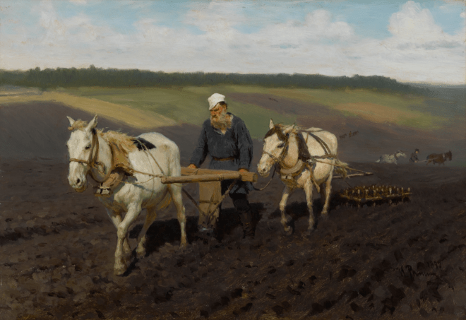
“Plowman L.N. Tolstoy on arable land” was painted by Ilya Efimovich Repin in 1887. It is an oil painting on cardboard of 27.8 X 40.3 cm situated in the State Tretyakov Gallery in Moscow. It is a household portrait painted in a realistic style, which is similar to a photograph. This painting, despite the ambiguous opinion of his contemporaries and numerous caricatures, remains one of the canonical images of the outstanding classic of Russian literature.
The lithograph from the painting was published in 1887 by A. A. Ilyin’s Cartographic Establishment. . We know that the publication aroused the displeasure of the Tolstoy family, who considered it undesirable “to distribute a picture depicting him in his most intimate life, because of a letter dated september 28, 1887 in which the family’s wish “not to expose this drawing to the public, not to distribute and not to sell” was expressed. Only on November 10, 1887 will Tolstoy agree to the publication as a result of his correspondence with V.V. Stasov, V.G. Chertkov, I.E. Repin and N.N..
For a week in August 1887, Repin stayed with the Tolstoys in Yasnaya Polyana. There he painted two large pictorial portraits of Tolstoy, and in addition, the artist made many drawings from the inhabitants of Yasnaya Polyana and a small pictorial painting “Plowman L.N. Tolstoy on arable land”. This small picture has not only artistic significance, but also documentary value.
We know that in the 1970s, a profound turning point took place in Tolstoy’s life. Like the hero of his story “After the Ball” Ivan Vasilyevich, the writer was painfully looking for an answer to the question: “How to live?”. He strove to leave that circle of wealthy people who do not know labor, but to which he belonged by birth. Tolstoy wanted to fill his life with work; He created novels, taught children at the school he founded, plowed the land, helping the poorest peasants, learned to make boots, etc. He considered simple physical labor to heal a person both physically and spiritually.
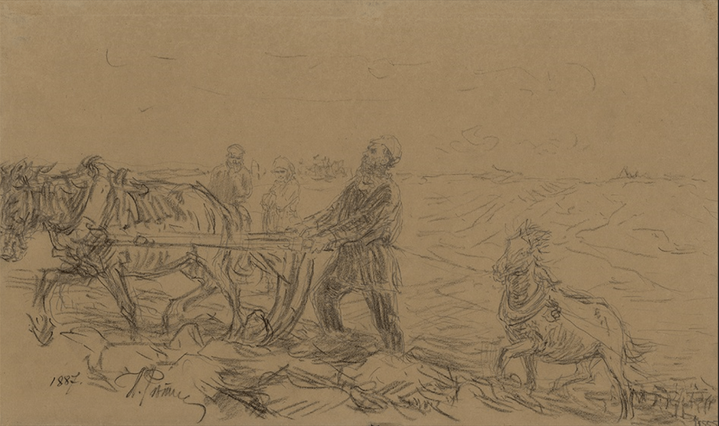
Repin recalled how the painting “Plowman L.N. Tolstoy on arable land” appeared:
“One hot August day, in the very sun, after breakfast, Lev Nikolayevich was going to plow the widow’s field … For six hours, without rest, he plowed the black earth with a plow, then going uphill, then going down the sloping terrain to the ravine. I had an album in my hands, and, without wasting time, I stood in front of the middle of the line of his passage and caught the features of the moment the entire cortege passes by me. This lasted less than a minute, and, to double the time, I made a transition through the plowing to the opposite point, about twenty paces away, and stood there again, waiting for the group. I checked only the contours and size ratios of the shapes; shadows after, from one point, at one moment.”
Repin made a sketch in his notebook, on which he later painted the original. The work was created in his usual technique: without fine detail, he was able to convey the impression of live action.
Another, less known sketch also attributed to Repin has been preserved. On this one, the famous plowman seems arrogant, and the peasants watching him look with irony. Each of the horse appears to have its own character: one meekly “corrects its service”, the other seems to demonstrate liveliness and rebelliousness .
Description of the painting
In the center are two white horses. One is harnessed to the plow, the second pulls the harrow. The horses are not from the master’s stables: the ridge and mosses appear, the bellies sag, which is typical when feeding with hay alone.
The whole appearance of Tolstoy, his demeanor is emphasized, simple, ordinary, everyday and at the same time deeply meaningful, individual. He does not look at the viewer, giving all his attention to his work. It gives the impression of a randomly seen scene. In Tolstoy we see a purely Russian face, more like a peasant than an aristocratic gentleman, ugly, with irregular features, but very significant, intelligent; a taut, proportionate figure, in which one can see the peculiar grace and free naturalness of a well-mannered person – such is that versatile and extremely specific characteristic of Tolstoy’s appearance, which makes him unlike anyone else. The careful fixation of all these features allowed Repin to convincingly convey through the external appearance the essence of the nature of the person being portrayed, all its complexity and inconsistency. Having portrayed the famous writer, busy with simple peasant labor , the artist managed to convey the calm and everyday life of what is happening.
Using soft colors, Repin gave a natural shade to the plowed land, greenish-yellow fields that have not yet been touched by a plow, a gray strip of forest on the horizon.
The plot of Repin’s work was widely replicated during the lifetime of the classic. It could be seen on knife handles, porcelain, cologne bottles, various embroideries and souvenirs. In 1908, a whole series was published to coincide with the writer’s anniversary. Sometimes such popularity gave rise to jokes. One of them: “They report to Tolstoy:“ Sir, it’s time to plow. ”
I hope you enjoyed this painting as much as I did. You can also check out our article about Leo Nikolayevich Tolstoy: Who is Leo Nikolayevich Tolstoy?
If you liked this article, subscribe , put likes, write comments!.
«Le laboureur LN Tolstoï sur des terres arables» a été peint par Ilya Efimovich Repin en 1887. Il s’agit d’une peinture à l’huile sur carton de 27,8 x 40,3 cm située dans la galerie nationale Tretiakov à Moscou. Il s’agit d’un portrait de famille peint dans un style réaliste, qui s’apparente à une photographie. Ce tableau, malgré l’opinion ambiguë de ses contemporains et de nombreuses caricatures, reste l’une des images canoniques du grand classique de la littérature russe.
La lithographie de la peinture a été publiée en 1887 par l’établissement cartographique d’AA Ilyin. On sait que la publication a suscité le mécontentement de la famille Tolstoï , qui jugeait indésirable « de diffuser un tableau le représentant dans sa vie la plus intime, en raison d’une lettre datée du 28 septembre 1887 dans laquelle le souhait de la famille « de ne pas exposer ce dessin au public, de ne pas distribuer et de ne pas vendre » a été exprimé. Ce n’est que le 10 novembre 1887 que Tolstoï acceptera la publication à la suite de sa correspondance avec VV Stasov, VG Chertkov, IE Repine et NN.
Pendant une semaine en août 1887, Repine séjourna chez les Tolstoï à Yasnaya Polyana. Là, il a peint deux grands portraits picturaux de Tolstoï, de plus, l’artiste a fait de nombreux dessins des habitants de Yasnaya Polyana et une petite peinture picturale «Laboureur LN Tolstoï sur des terres arables». Cette petite image a non seulement une signification artistique, mais aussi une valeur documentaire.
On sait que dans les années 1970, un tournant profond s’est opéré dans la vie de Tolstoï. Comme le héros de son histoire «Après le bal» Ivan Vasilyevich, l’écrivain cherchait péniblement une réponse à la question: «Comment vivre?». Il s’efforça de sortir de ce cercle de riches qui ne connaissent pas le travail, mais auquel il appartenait de naissance. Tolstoï voulait remplir sa vie de travail ; Il a créé des romans, enseigné aux enfants à l’école qu’il a fondée, labouré la terre, aidé les paysans les plus pauvres, appris à fabriquer des bottes, etc. Il considérait le simple travail physique pour guérir une personne à la fois physiquement et spirituellement.
Repine a rappelé comment le tableau «Laboureur LN Tolstoï sur des terres arables» est apparu:
«Une chaude journée d’août, en plein soleil, après le petit déjeuner, Lev Nikolayevich allait labourer le champ de la veuve… Pendant six heures, sans repos, il a labouré la terre noire avec une charrue, puis en montant, puis en descendant le terrain en pente jusqu’au ravin. J’avais un album entre les mains, et, sans perdre de temps, je me suis planté devant le milieu de la file de son passage et j’ai saisi les traits de l’instant où tout le cortège passe à côté de moi. Cela a duré moins d’une minute, et, pour doubler le temps, j’ai fait une transition à travers le labour jusqu’au point opposé, à une vingtaine de pas, et je suis resté là à attendre le groupe. J’ai vérifié uniquement les contours et les rapports de taille des formes; des ombres après, à partir d’un point, à un moment donné.
Repine a fait un croquis dans son cahier, sur lequel il a ensuite peint l’original. L’œuvre a été créée dans sa technique habituelle : sans détails fins, il a pu donner l’impression d’action en direct.
Une autre esquisse moins connue également attribuée à Repine a été conservée. Sur celle-ci, le célèbre laboureur semble arrogant, et les paysans qui le regardent le regardent avec ironie. Chacun des chevaux semble avoir son propre caractère : l’un « exécute » docilement son service, l’autre semble faire preuve de vivacité et de rebellion.
Description de la peinture
Au centre se trouvent deux chevaux blancs. L’un est attelé à la charrue, le second tire la herse. Les chevaux ne proviennent pas des écuries du maître : la crête et les creux apparaissent, les ventres s’affaissent, ce qui est typique lorsqu’on se nourrit uniquement de foin.
Toute l’apparence de Tolstoï, son comportement est souligné, simple, ordinaire, quotidien et en même temps profondément significatif, individuel. Il ne regarde pas le spectateur, accordant toute son attention à son travail. Cela donne l’impression d’une scène vue au hasard. On voit chez Tolstoï un visage purement russe, plus paysan qu’aristocratique, laid, aux traits irréguliers, mais très significatif, intelligent; une figure tendue et proportionnée, dans laquelle on peut voir la grâce particulière et le naturel libre d’une personne bien élevée – telle est cette caractéristique polyvalente et extrêmement spécifique de l’apparence de Tolstoï, qui le rend différent de tout autre. La fixation minutieuse de toutes ces caractéristiques a permis à Repine de transmettre de manière convaincante à travers l’apparence extérieure l’essence de la nature de la personne représentée, toute sa complexité et son incohérence. Après avoir dépeint le célèbre écrivain, occupé par de simples travaux paysans, l’artiste a réussi à transmettre le calme et ce qui se passe dans la vie quotidienne.
Utilisant des couleurs douces, Repine a donné une teinte naturelle à la terre labourée, des champs jaune verdâtre qui n’ont pas encore été touchés par une charrue, une bande de forêt grise à l’horizon.
L’intrigue du travail de Repine a été largement reproduite pendant la durée de vie du classique. On pouvait le voir sur des manches de couteaux, de la porcelaine, des bouteilles d’eau de Cologne, diverses broderies et des souvenirs. En 1908, toute une série est publiée à l’occasion de l’anniversaire de l’écrivain. Parfois, une telle popularité a donné lieu à des blagues. L’une d’elles: «Ils rapportent à Tolstoï:« Monsieur, il est temps de labourer. ”
J’espère que vous avez apprécié ce tableau autant que moi. Vous pouvez également consulter notre article sur Léon Nikolaïevitch Tolstoï :Qui est Léon Nikolaïevitch Tolstoï ?
Si vous avez aimé cet article, abonnez-vous, mettez des likes, écrivez des commentaires !.
This week a lot of things happened at once, and more should show up soon. First in our section Russian courses I worked on the verbs Conjugation and motion verbs, so we have more than 2000 verbs translated and one with its conjugation. (Yes a third of the others are still in the private part of the site. The explanation is very simple, I’d rather work on the private part so what shows up in our lessons is about finished. (I still have to go back to that Russian alphabet…)
Then as I said in September (I should have said december) our new bilingual books would come out, so I added Germinal from Émile Zola in bilingual French/English, and Monsieur de Pourceaugnac by Molière also French/English. Most of the others will follow pretty soon. I just verify them one more time before to remove the password.
Cette semaine, beaucoup de choses se sont produites en même temps, et d’autres devraient bientôt apparaître. D’abord dans notre rubrique cours de russe j’ai travaillé sur la conjugaison des verbes et les verbes de mouvement , nous avons donc plus de 2000 verbes traduits (en anglais) et un avec sa conjugaison. (Oui un tiers des autres sont encore dans la partie privée du site. L’explication est très simple, je préfère travailler sur la partie privée donc ce qui s’affiche dans nos cours est à peu près terminé. (Il me reste à revenir à cet alphabet russe…) Je n’ai pas oublier le français mais pour l’instant la traduction des verbes est directement sur les verbes conjugués.
Puis comme j’avai dit qu’en septembre (j’aurais dû dire décembre) nos nouveaux livres bilingues sortiraient, alors j’ai ajouté Germinal d’Émile Zola en bilingue français/anglais, et Monsieur de Pourceaugnac de Molière lui aussi français/anglais. La plupart des autres suivront bientôt. Je vais les vérifier une fois de plus avant de supprimer le mot de passe.
Arkady Alexandrovich Plastov (Аркадий Александрович Пластов) (1893–1972) was born in a family of hereditary icon painters, and made a great contribution to the development of Russian culture. Beginning in 1935, he has been creating genre paintings, in which he embellished the life of the Soviet village. So an important place in his work was occupied by the image of the everyday life of peasants against the backdrop of their beautiful country.
The painting “Spring” is an oil on canvas which was painted in 1952. it is a genre scene from the life of a young peasant woman who came to the spring to get clean water. Effectively, there was no running water in the villages at this period, and someone had to go sometimes far to get water with buckets.
In the foreground we see a girl standing on logs holding a yoke with large iron buckets in her hands.
The barefoot girl is dressed in a beautiful light dress with a miniature pattern, and a clean white scarf frames her head, from under which thick golden braids peek out.
The heroine of the picture is serious and completely focused on the process of collecting water.
One of the bucket is already full, while she fills the other with a stream of clean, transparent water from a small spring. We can see splashing water on the side of the bucket, which creates the dynamics of the composition of the canvas. We can also admire how clean and transparent is the water that the artist managed to paint. The crystal freshness of cool water illuminated by the warm summer sun is literally felt.
Under the bucket, the spilled water formed a small pond, which was overgrown with reeds.
Behind the girl’s back we see a lot of greenery, which occupies a large area of the work. The vegetation is quite high and dense, which means that the spring is practically not noticeable from the outside. In the upper part of the picture, a blue sky with white clouds is slightly visible.
The color scheme is quite warm. This is expressed in the yellow-green colorful strokes of plants and the girl’s scarlet blush. Also, solar accents are shown in the color spots of her clothes. There is a battle of contrasts. Light tones contrast with dark ones. Thus, the harmony of the painted picture is created.
This canvas by Arkady Plastov perfectly cheers up and evokes the warmest and most positive feelings. Due to the calm plot, pleasant shades of colors, the harmony of nature and peasant life is conveyed.
I hope you enjoyed this painting as much as I did
If you liked this article, subscribe , put likes, write comments!.
Arkadi Alexandrovitch Plastov (Аркадий Александрович Пластов) (1893-1972) est né dans une famille de peintres d’icônes héréditaires et a apporté une grande contribution au développement de la culture russe. À partir de 1935, il a crée des peintures de genre, dans lesquelles il a embellit la vie du village soviétique. Ainsi, une place importante dans son travail a été occupée par l’image de la vie quotidienne des paysans dans le contexte de leur beau pays.
Le tableau «La Source » est une huile sur toile qui a été peinte en 1952. c’est une scène de genre de la vie d’une jeune paysanne qui venait à la source pour obtenir de l’eau potable. Effectivement, il n’y avait pas d’eau courante dans les villages à cette époque, et quelqu’un devait parfois aller loin pour aller chercher de l’eau avec des seaux.
Au premier plan, nous voyons une fille debout sur des bûches tenant un joug avec de grands seaux en fer dans ses mains.
La fille aux pieds nus est vêtue d’une belle robe légère avec un motif miniature, et une écharpe blanche propre encadre sa tête, sous laquelle d’épaisses tresses dorées se montrent.
L’héroïne de l’image est sérieuse et complètement concentrée sur le processus de collecte de l’eau.
L’un des seaux est déjà plein, tandis qu’elle remplit l’autre d’un jet d’eau propre et transparente provenant d’une petite source. Nous pouvons voir des éclaboussures d’eau sur le côté du seau, ce qui crée la dynamique de la composition de la toile. On peut aussi admirer à quel point l’eau que l’artiste a réussi à peindre est propre et transparente. La fraîcheur cristalline de l’eau fraîche éclairée par le chaud soleil d’été est littéralement ressentie.
Sous le seau, l’eau déversée forme un petit étang envahi de roseaux.
Derrière le dos de la fille, nous voyons beaucoup de verdure, qui occupe une grande partie de l’œuvre. La végétation est assez haute et dense, ce qui signifie que la source n’est pratiquement pas perceptible de l’extérieur. Dans la partie supérieure de l’image, un ciel bleu avec des nuages blancs est légèrement visible.
La palette de couleurs est assez chaude. Cela s’exprime dans les traits colorés jaune-vert des plantes et les joues écarlates de la fille. En outre, des accents solaires sont montrés dans les taches de couleur de ses vêtements. Il y a une bataille de contrastes. Les tons clairs contrastent avec les tons sombres. Ainsi, l’harmonie de l’image peinte est créée.
Cette toile d’Arkady Plastov réconforte parfaitement et évoque les sentiments les plus chaleureux et les plus positifs. En raison de la tranquillité de la scène, des nuances de couleurs agréables, l’harmonie de la nature et de la vie paysanne est véhiculée.
J’espère que vous avez apprécié cette peinture autant que moi
If you liked this article, subscribe , put likes, write comments!.
I also wrote an article about the painting “The Flying Carpet” by Vasnetsov in English and in French as usual, and evidently, I continue to work on our bilingual books.
I hope you’ll find something to enjoy
If you liked this article, don’t forget to like and share.
J’ai également écrit un article sur le tableau « Le Tapis Volant » de Vasnetsov en anglais et en Français comme d’habitude, et bien sur je continue de travailler sur nos livres bilingues.
J’espère que vous trouverez quelque chose à apprécier
Si vous avez aimé cet article, n’oubliez pas de liker et de partager.